Role
UX/UI Designer
Timeline
2+ years
Tools
Figma, Lucid, Google Suite
Type
Medical/healthcare technology
Complex hardware deserves equally thoughtful software.
The context
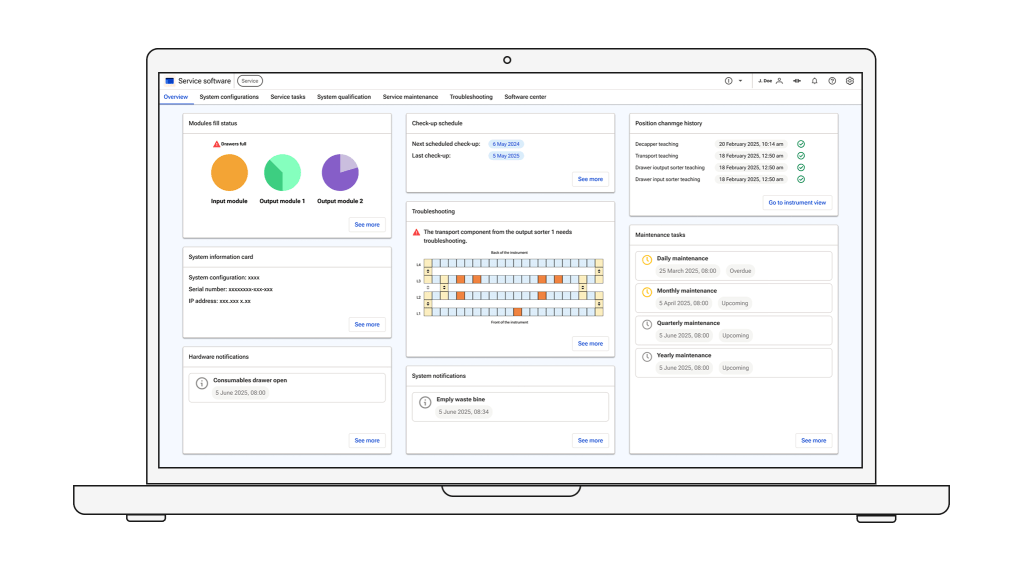
The client’s existing medical instrument would no longer meet updated industry standards after 2026, so a new version needed to be developed — same core functions, but safer and better designed. Beyond the physical redesign, the project included new software for the instrument’s screen and one for its setup and servicing, the service software.
A pre-analytics instrument prepares samples for lab analysis: scanning barcodes, checking sample quality, and splitting tubes when needed.
Key terms used throughout:
Transport – moves samples between modules
Decapper – removes the cap from tubes
The challenge
An earlier instrument and its software existed as a reference, but the client asked to rely on it minimally, since it had significant flaws and risked introducing bias. My challenge was to build a deep understanding of how the instrument works in order to design an optimal experience.
I focused primarily on the Service software — used to install the instrument in a new lab and to service it afterward.
The approach
The project opened with a workshop where a user representative flagged key issues with the old system:
- Safety gaps – built in the ’90s, the old system let users open module covers mid-operation, exposing them to moving parts and biohazard samples.
- Menu overload – tabs had been added over the years with no logical structure.
- Little guidance – users had no support through complex flows.
- Almost no visuals – nothing helped users understand what to do.
Development ran in parallel across teams and formal written requirements were limited. I learned the instrument’s mechanics directly from the service software user representatives and the hardware team — through demonstrations, Q&A, and some written specs with images — since understanding the hardware was essential to designing intuitively. We iterated through regular feedback sessions, adjusting designs as hardware decisions changed.
Communication was critical given the size of the team and the tight timeline, and not everyone was equally collaborative — navigating that was part of the job.
Discovery
→
ideation
→
design
→
test
→
dev handoff
The process
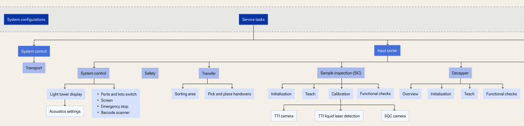
Information architecture
I started here since the input I received lacked clear structure. Mapping the navigation levels first gave the rest of the project a foundation to build on.
Low-fidelity wireframes
Since development was happening in parallel, I worked on flows and final UI simultaneously. In Figma, I integrated screens directly with user flows, which made presentations clearer and handoff to development smoother.
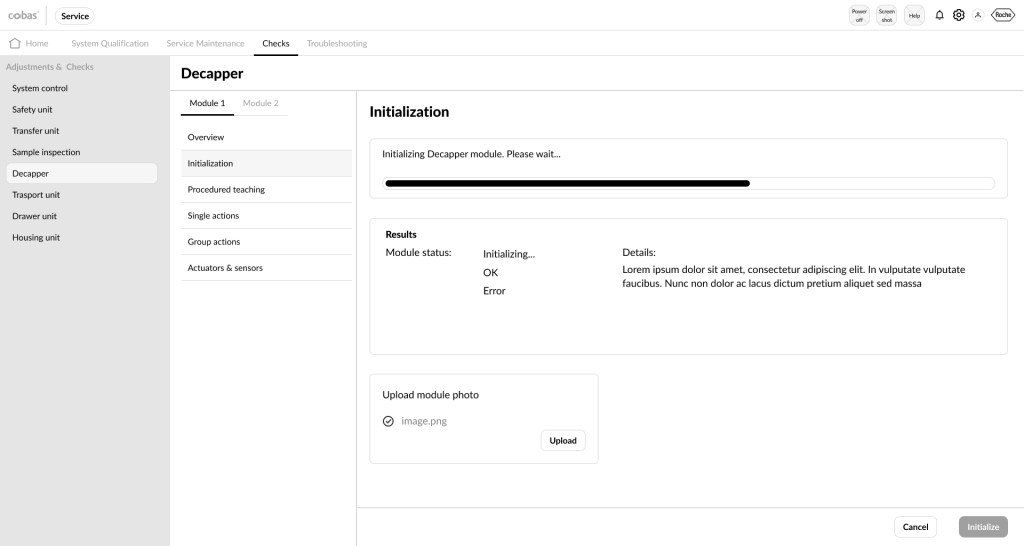
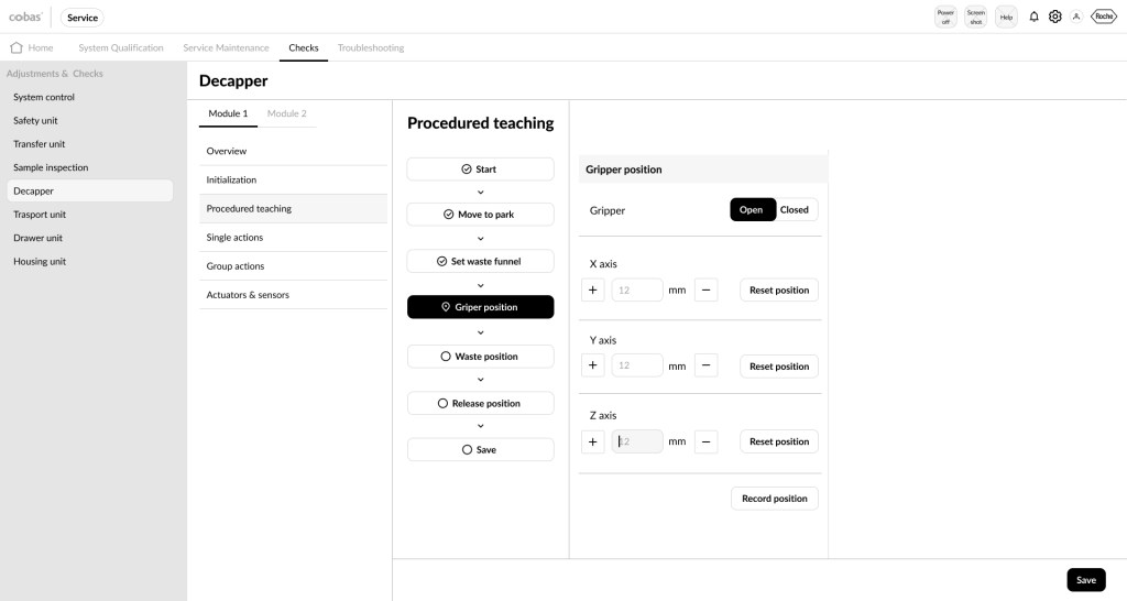
Below: early wireframes of the service software’s home screen and the decapper teaching flow.
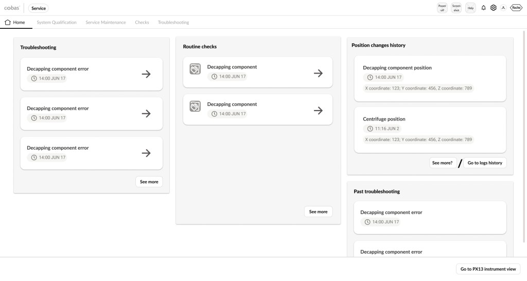
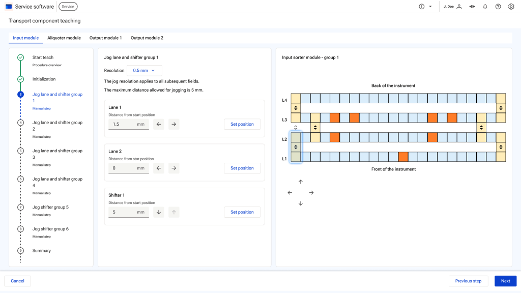
These flows are long and complex, so I introduced a stepper to help users track their progress. Navigation was equally important, given how much it had held back the previous software.
Design system
A mature design system was already in place, and regular design critiques with client-side designers outside the project brought valuable outside perspective.
Final screens
After several iterations, I landed on a design pattern I could reuse across future screens — a big efficiency gain given the pace of change on the project.
I built in clear visual feedback throughout — green checkmarks confirm successful actions. (Some screens shown still contain placeholder text and images.)
Users specifically requested real photos over 3D renders, since they’re highly visual, along with optional video guidance for key steps. A photo/video shoot is planned once the instrument is operational, to replace all placeholders.
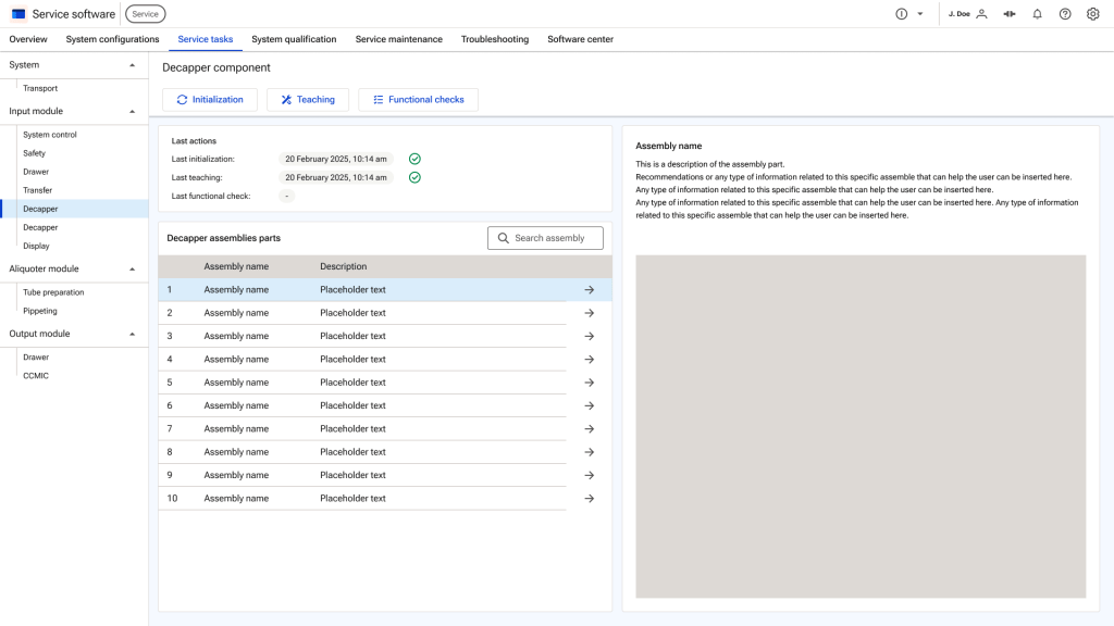
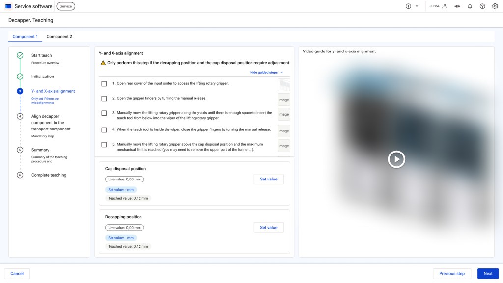
I incorporated clear visual feedback throughout the flow to guide users—for example, the green checkmarks shown above indicate successfully completed actions and are consistently reused in the stepper.
Workflows are presented in modals to maintain focus and minimize cognitive load during complex tasks.
↓
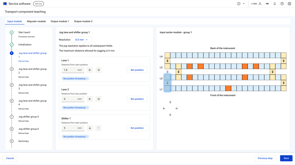
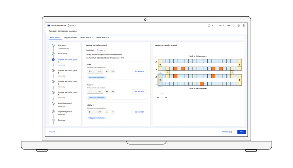
The usability testing either confirmed or informed us of small changes needed for better usability (we had a user representative on our team, which is why we got the big picture right from the start). For example, on this screen from the teach transport, there was a need to:
- Make it clearer which group is in the current step (I proposed using a stronger blue in the drawing on the right).
- Clarify which side was the front and which was the back of the instrument in the illustration.
- Remove the arrows under the illustration, as they were causing confusion (the direction of the jogging was clear enough without them).
- Add a timestamp to indicate when a position was set.
Outcome
The project was still in progress when I left, but the feedback spoke for itself. Usability testing ran throughout, giving us real input at every stage. Users found the improvement over the previous software so significant they said the two couldn’t even be compared — and rated the overall usability as very good.
Reflections
This project deepened my interest in hardware-driven design — intimidating at first, but ultimately one of the most intellectually engaging challenges I’ve worked on. It also reinforced how much a solid design system supports fast, organized execution.
Working with a large, cross-functional team strengthened my collaboration and presentation skills — I presented to both the internal software team and the client directly, which was a significant step in my growth as a designer.

