Role
Product Designer
Timeline
8 weeks
Tools
Figma and Miro
Type
UX Case Study / Academic
Junior designers lack access to a centralized space for collaboration and mentorship.
The context
This was my first UX project, completed during a UX course at SIIT over four months.
The theme: design solutions to help designers early in their careers (under 2 years of experience) accelerate their professional development.
The project had two phases — a collaborative research phase with a team of five, followed by an individual design phase.
Research
I chose qualitative research as the primary method, deciding early on that interviews would give the richest insight into users’ real needs. I conducted 10 semi-structured interviews (~17 questions each).
After transcribing and reviewing all interviews, I built an affinity map in Miro to surface recurring themes. Key categories that emerged: mentorship, career path, pain points, tools & skills, and wishful thinking around learning formats.
How Might We questions that guided the design direction:
- HMW help designers find a mentor?
- HMW bring the UX community together?
- HMW provide practical learning outside of company-internal programs?
- HMW facilitate workshops on specific, applied topics?
Key research findings:
Users expressed a strong interest in workshops on specific topics, not broad courses
Having a mentor significantly accelerates junior designer growth — and many don’t have one
Networking is underrated but essential
There are plenty of online resources; what’s missing is hands-on, practical learning
The challenge
Online learning resources are abundant, but affordable, practical workshops — held outside of companies and open to any designer — are rare. At the same time, many junior designers lack access to mentors.
I validated this direction with a concept test before moving into design.
The solution: Workshop connection
A mobile app where designers can find and sign up for hands-on, topic-specific workshops — primarily in-person, to foster real community and connection. The app serves both sides: mentees looking to learn, and experienced designers who want to teach.
Two user types, two main flows:
- Mentee — browse workshops by city and sign up
- Mentor — propose and manage workshops
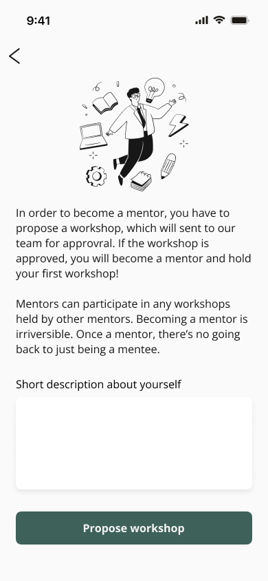
Workshop submissions go through a review process to maintain quality — both new mentor applications and new workshop proposals.
Research
→
Define
→
Ideate
→
Prototype
→
Test
The process
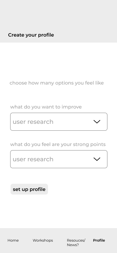
Low-fidelity wireframes & user testing
I used Figma for both low and high fidelity work, integrating screens with user flows throughout. Having designers as test users was particularly valuable — feedback came with clear rationale, which helped me learn UX best practices alongside usability improvements.
Notable decisions from testing:
- Added an error prevention message before a user commits to becoming a mentor — a role that comes with real responsibility
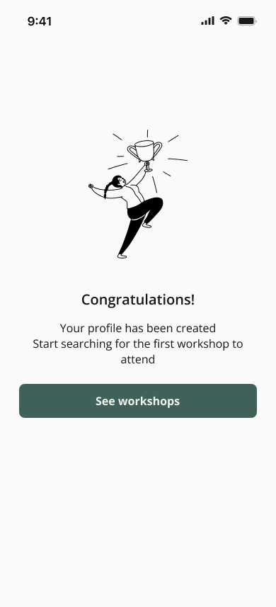
- Removed the menu bar and header from the congratulations screen after a user flagged it as unnecessary clutter
- Simplified the menu by removing a resources section — there are already plenty of dedicated platforms for that
Sign-up flow
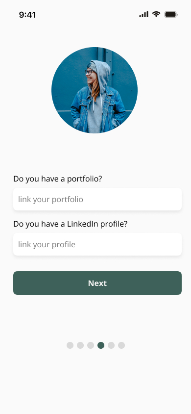
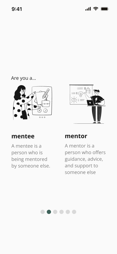
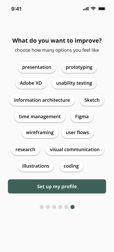
Rather than a single long form, I broke the sign-up into multiple focused screens, guided by a progress indicator. Illustrations were used at key decision points (mentee vs. mentor choice, confirmation screens) to add warmth and draw attention where it matters. The result: more screens, but a lighter, more engaging experience — not more steps.
One point from the feedback I received was that it would be appreciated to make the sign up flow a bit more interactive and friendlier, especially this being an app for designers. This is one of the examples of a small change with a big impact.
→
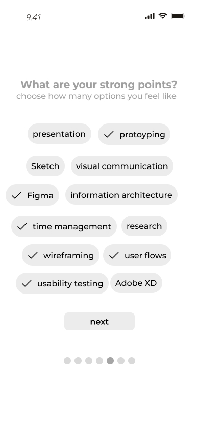
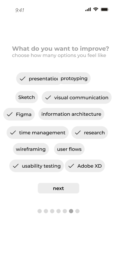
These are some final screens from the sign up flow.
Design system
I built a design system using shades of green — a color associated with growth, learning, and new beginnings, which felt right for an app aimed at early-career development.
High-fidelity screens
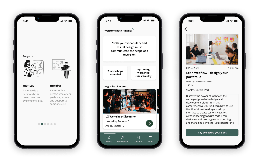
The home screen surfaces workshops filtered by city, with tabs for upcoming, ongoing, and past sessions. A rotating UX principle at the top adds a small moment of daily learning. The calendar view helps users plan around their schedule. User profiles link to LinkedIn and portfolios, and mentors can optionally offer private one-on-one sessions.
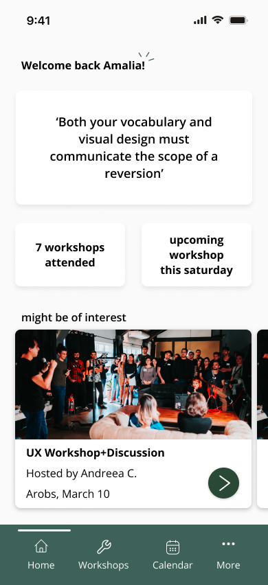
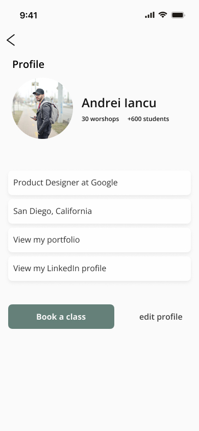
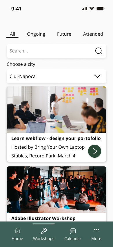
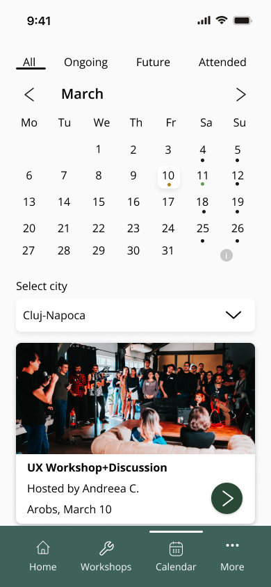
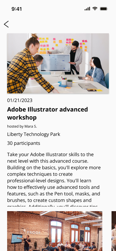
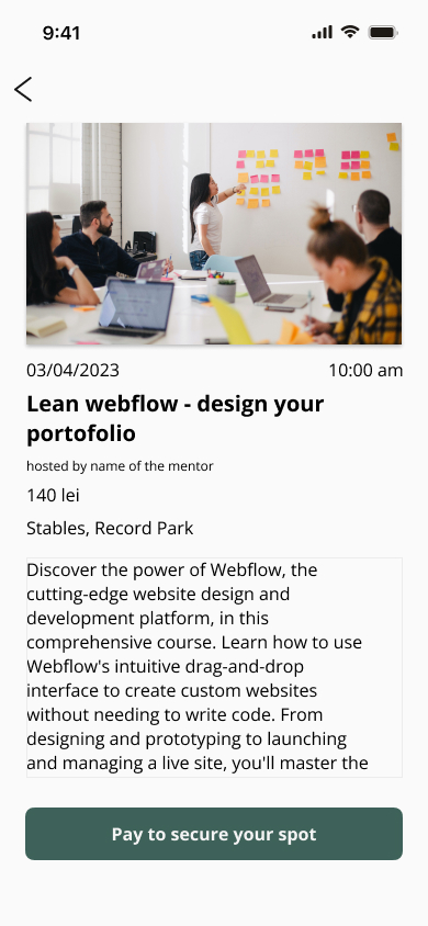
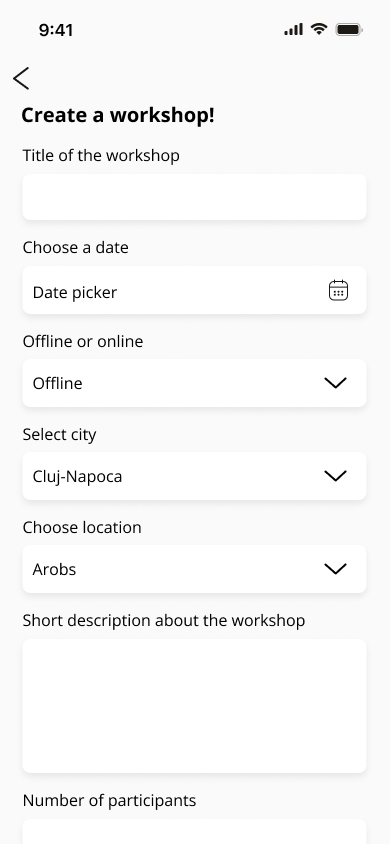
Here are more final screens from the app, the home screen, the user profile, the workshops page, the calendar, pages from one workshop and also the page for mentors to create a new workshop.
Reflections
Working on The Workshop Connection confirmed something I suspected from the start — there is a genuine, unmet need for this kind of community platform in the Romanian UX space. Designers here are eager to connect, learn together, and grow through shared practice. That validation made the project feel meaningful beyond just an academic exercise.
As my first UX project, this was a steep but rewarding learning curve. I grew enormously as a designer — from conducting my first research interviews to making real decisions about information architecture and interaction design. Every step pushed me to think more critically and design with more intention.
I would have liked to have time for prototyping and usability testing the end product. Getting the designs in front of people and iterating on their feedback would have added another layer of confidence to the final solution.

